
Tetra Pak
Packaging differentiation platform
Brand strategy | UX strategy | Got a market strategy
Context:
Tetra Pak's customers, premium dairy and juice brand owners, were facing an increasingly crowded chilled category and needed a way to meaningfully stand out on shelf. ‘
At the same time, Tetra Pak had a wide range of differentiation capabilities across their portfolio but no clear, engaging way to help customers understand and explore what was possible for their brand. The opportunity was to solve both problems at once.
Solution
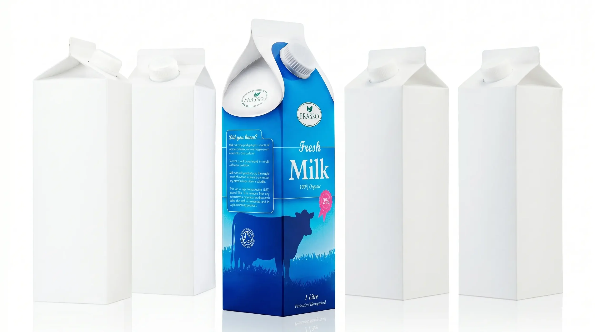
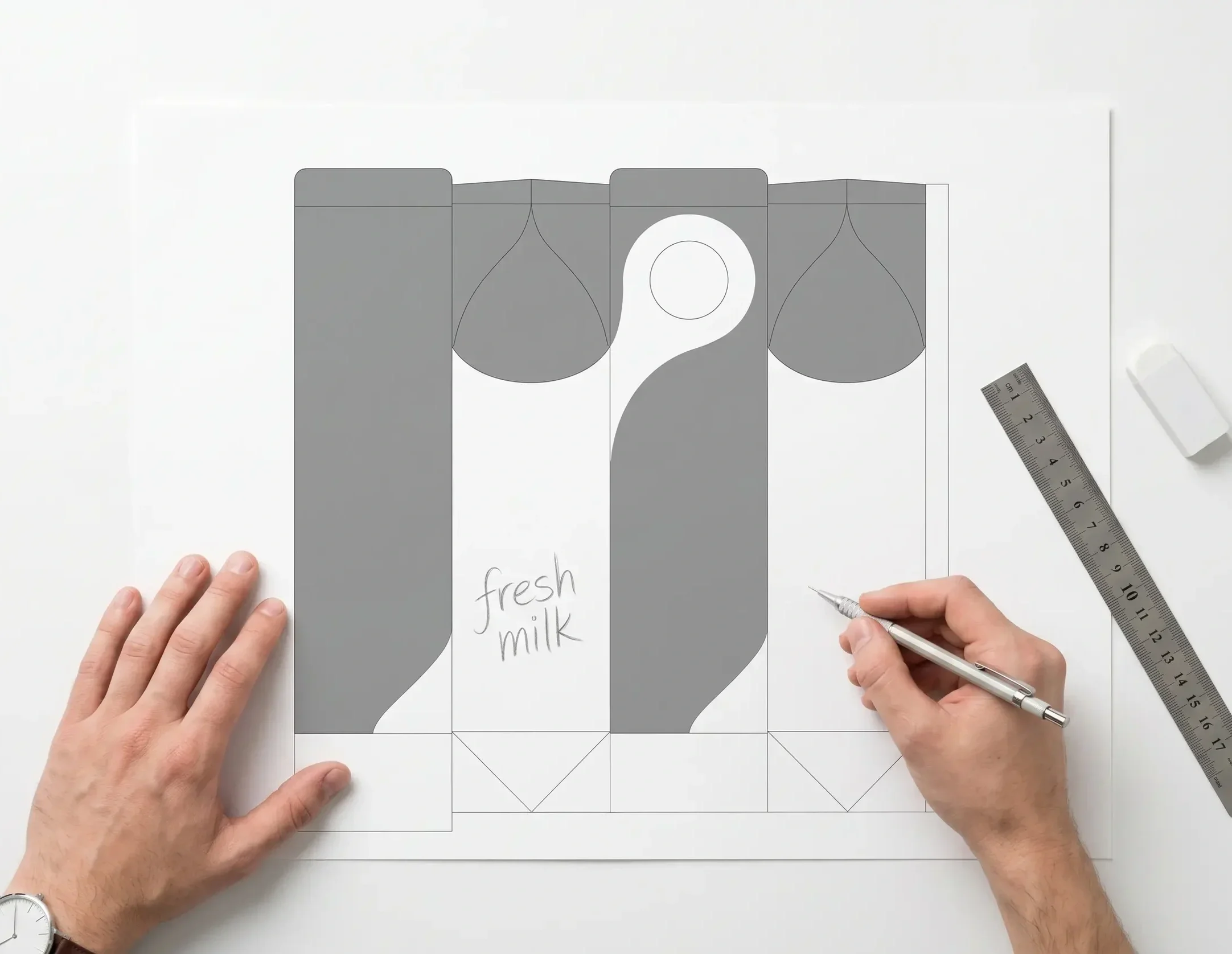
The answer was a two-part platform: a new premium package format paired with a tool that gave customers the power to make it their own. The Tetra Rex Pearl reimagined the ubiquitous Tetra Rex carton, moving away from its utilitarian form toward a more fluid, organic shape that reflected the natural character of premium dairy and juice products. A suite of graphic design templates guided brand owners on how to apply graphics in ways that accentuated the form.
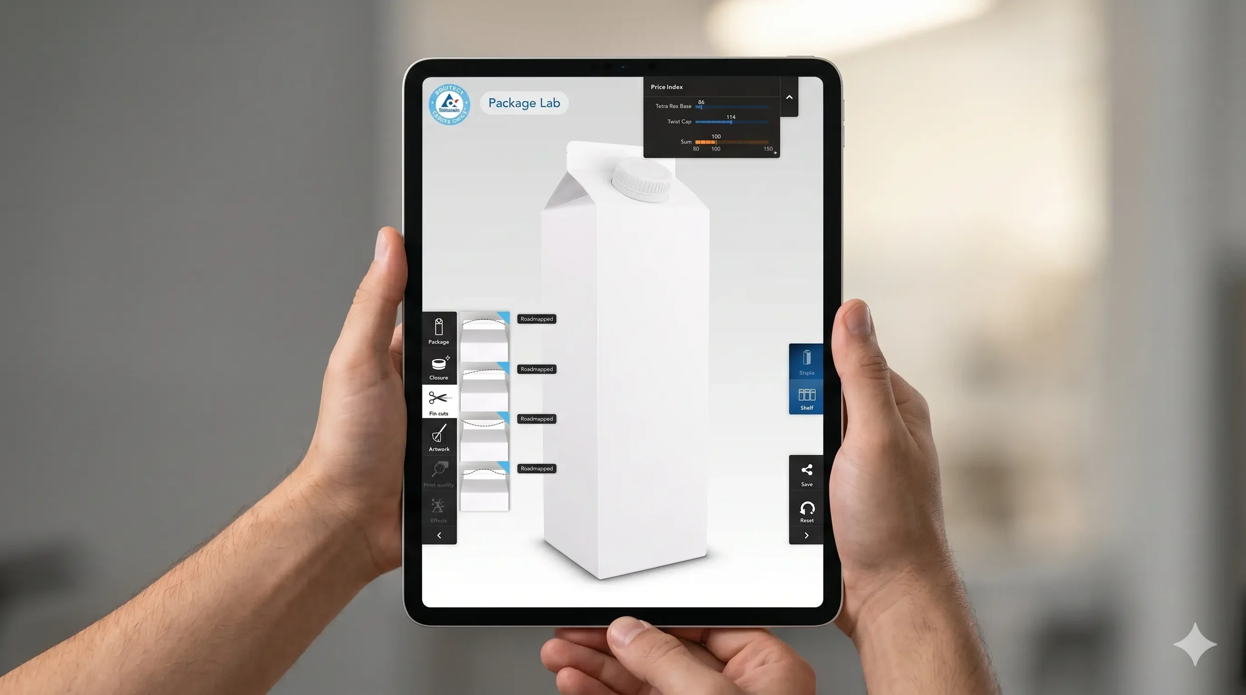
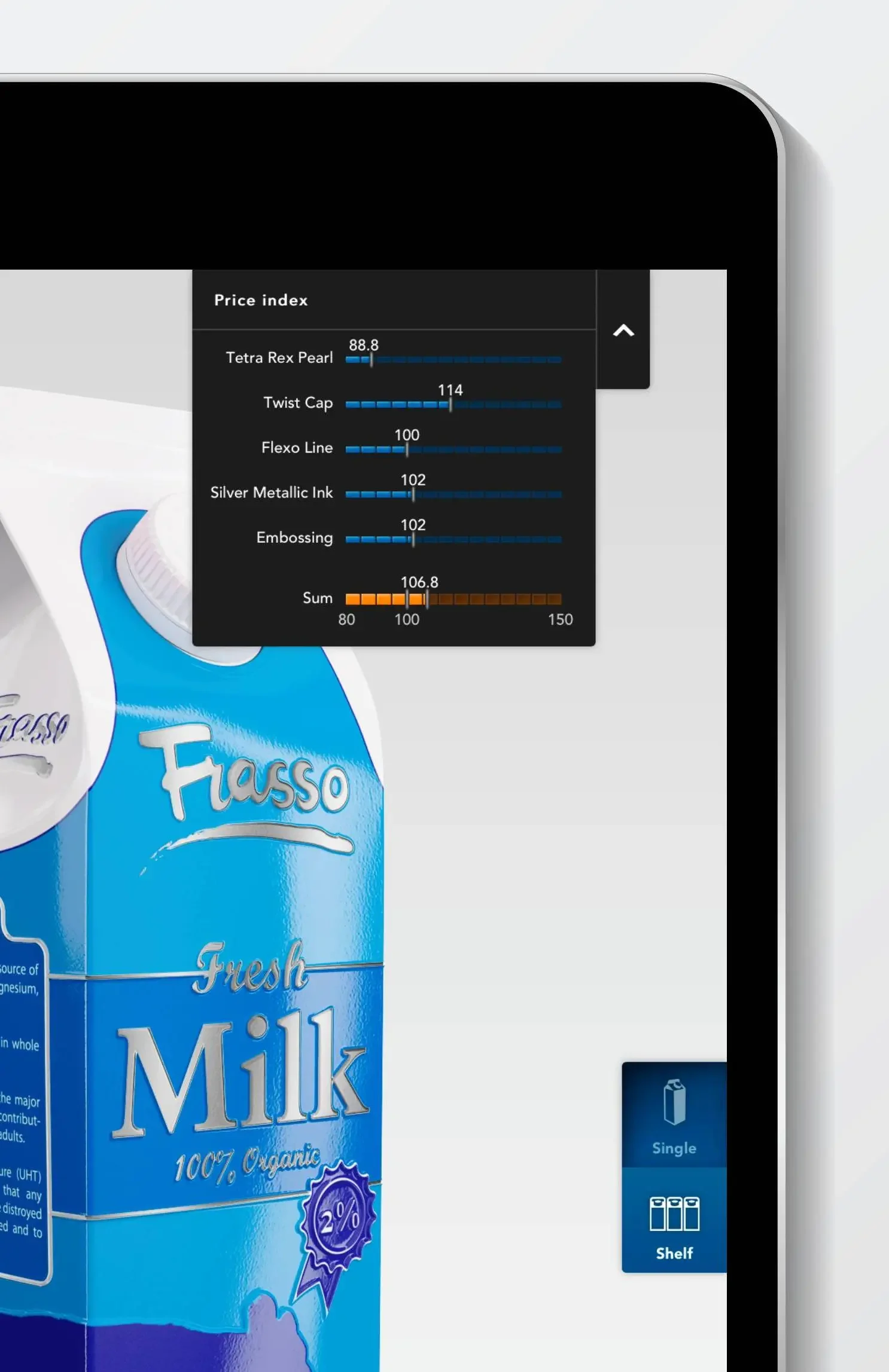
Alongside the Pearl, Package Lab, an interactive visual configurator allowed customers to browse and select from a menu of visual and functional attributes, much like configuring a car. A built-in price indicator let customers make informed trade-offs as they explored, consolidating Tetra Pak's full differentiation offer into a single, controlled framework.
Impact
Consumer testing showed that the Pearl outperformed all competing cartons in visual appeal, uniqueness, category fit, and perceived quality, with consumers even assuming the product inside tasted better.
Both solutions were launched to critical acclaim at Anuga FoodTec, the international trade fair for food technology. However, the broader significance extended far beyond the product itself.
Together, the Pearl and Package Lab represented a fundamental shift in Tetra Pak’s commercial strategy: moving away from cost-based selling toward a value-based model where differentiation and brand impact became the primary currency.
My Role
I conceived and owned the project, directing a cross disciplinary design team to shape the design direction for both the package and configurator, and establishing strategic narrative and business case. I orchestrated a cross-functional stakeholder group consisting of the relevant business unit, R&D, and IT in order to shape a well-structured case for further development into the market.